Educational Gaming: Improving the Instructor platform
How do we prevent new instructors from being intimidated by our gaming platform?
Why Did I Prioritize This?
Our company was rapidly increasing both the functionality of our platform as well as the number of games we offered. Despite these priorities, it was apparent through user testing and in-class observation that there were usability issues with our interface. If we hoped to expand our user base geometrically, without live on-boarding sessions with every instructor, it was urgent that the system become more intuitive.
Problems To Solve
New professors often had difficulty using our platform without help. We addressed this somewhat with recorded video screencasts and live one-on-one sessions. But that’s not scalable. There was a lot of complex functionality in our system; instructors had to be able to browse through our games, create a playlist for their classroom, configure each game, run them in class, view and display the results collectively, then decide on the fly if they wanted to play again with different settings. It was easy to make a mistake, which reflected badly on our company, even if it ‘technically’ wasn’t our fault.
At the end of the day their mistakes WERE our fault, so we needed to reduce them to a minimum.

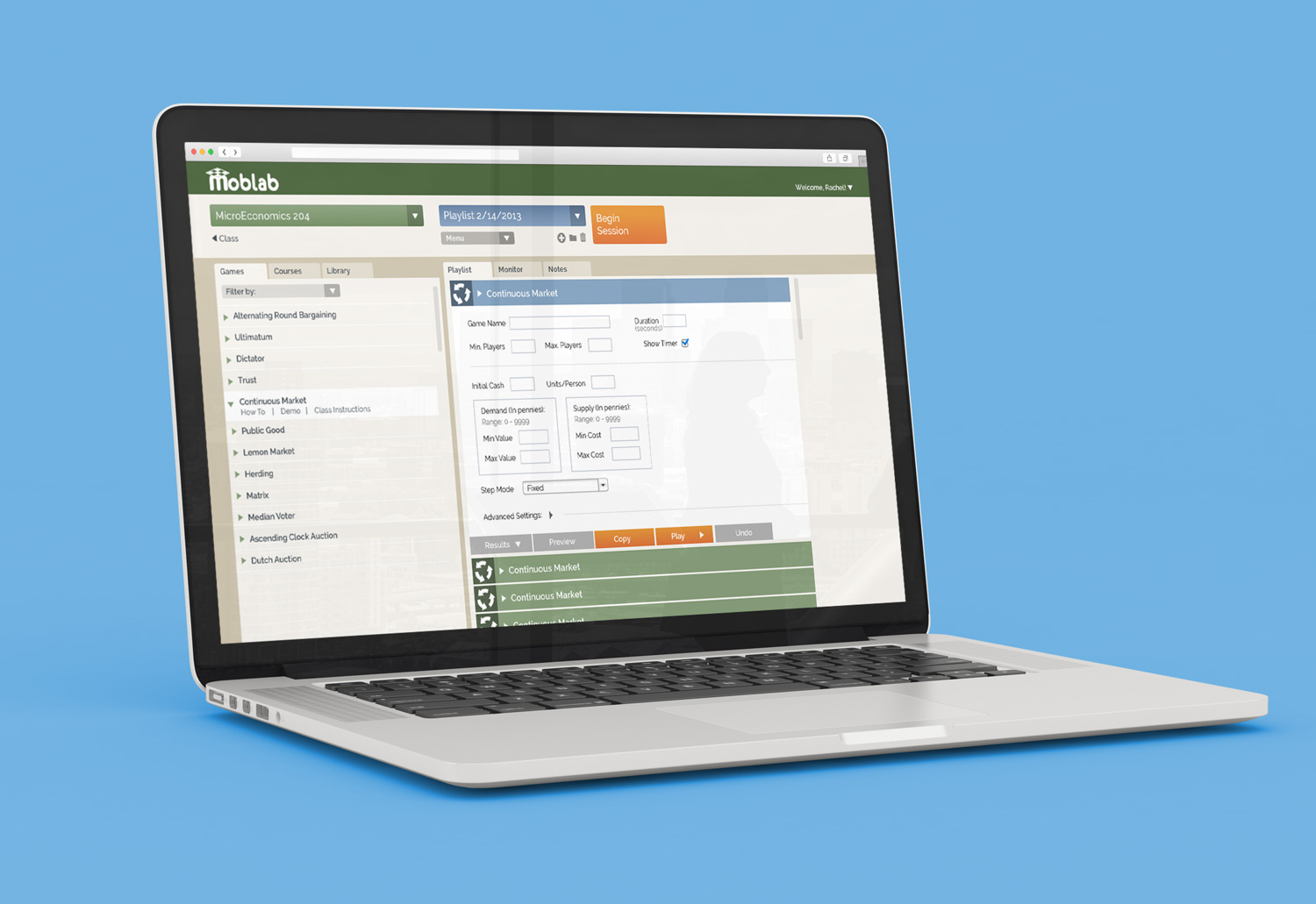
Original Look
The Solution
I started outlining points of confusion I’d had when trying to understand our platform. Then I performed competitive analysis on similar systems, however, our product was so unique there weren’t many options to choose from. Sites that featured playlists and examples of enterprise software proved useful in helping me understand how other folks had solved the problem of massive functionality with minimum intimidation.
Our persona in this case was specific: a busy, distractible economics professor of higher education, who is using a laptop in a loud, possibly erratic environment. I rode along with our head of marketing as she physically onboarded professors, to watch them try to understand our platform, what they expected from us and any initial confusion. In addition, I spent time in classrooms as professors proctored games, taking notes of the pain points both students and professors faced.
Next I created user flows for new and experienced professors. Analytics and user feedback told us that instructors who had a difficult time understanding the platform or using it in class were unlikely to give us another try. No professor wanted to be embarrassed in front of his or her students. Because an instructor would use us year after year, every one who was turned off to our system represented a substantial loss.
I created a functional chart, noting dependencies and hierarchy of use. My goal was to hide functionality when the user did not need it, to help prevent the overwhelming experience of seeing a screen full of tools. In service to this, I created simple prototypes and began to work through them with our own team and others. I iterated on this over time, constantly searching for new ways to simplify.
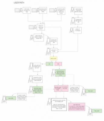
User path
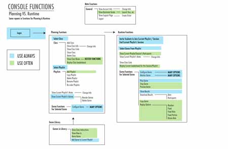
Function hierarchy

In-class observation
The Result
Because our primary focus was on the expansion of our games and functionality, repairing what I would call usability debt had to take second place. Nevertheless, thanks to hard data from analytics, user testing, and classroom observation, I was able to iteratively improve our proctoring platform over time, prioritizing those issues that would make the largest improvements in reducing instructor confusion.
Ultimately, there were fewer support calls and fewer instances of professors giving up on us after a failed attempt to run a playlist. We also saw demonstrable improvement in the classroom experience by helping pinpoint in-class pain points and addressing them with the UI and in the FAQ. Finally, we saw a substantial increase in professors who were able to adopt our platform without requiring live video on boarding.